Hawai‘i Urban Science

Hawaiian Home Lands x Military-occuped/leased Lands
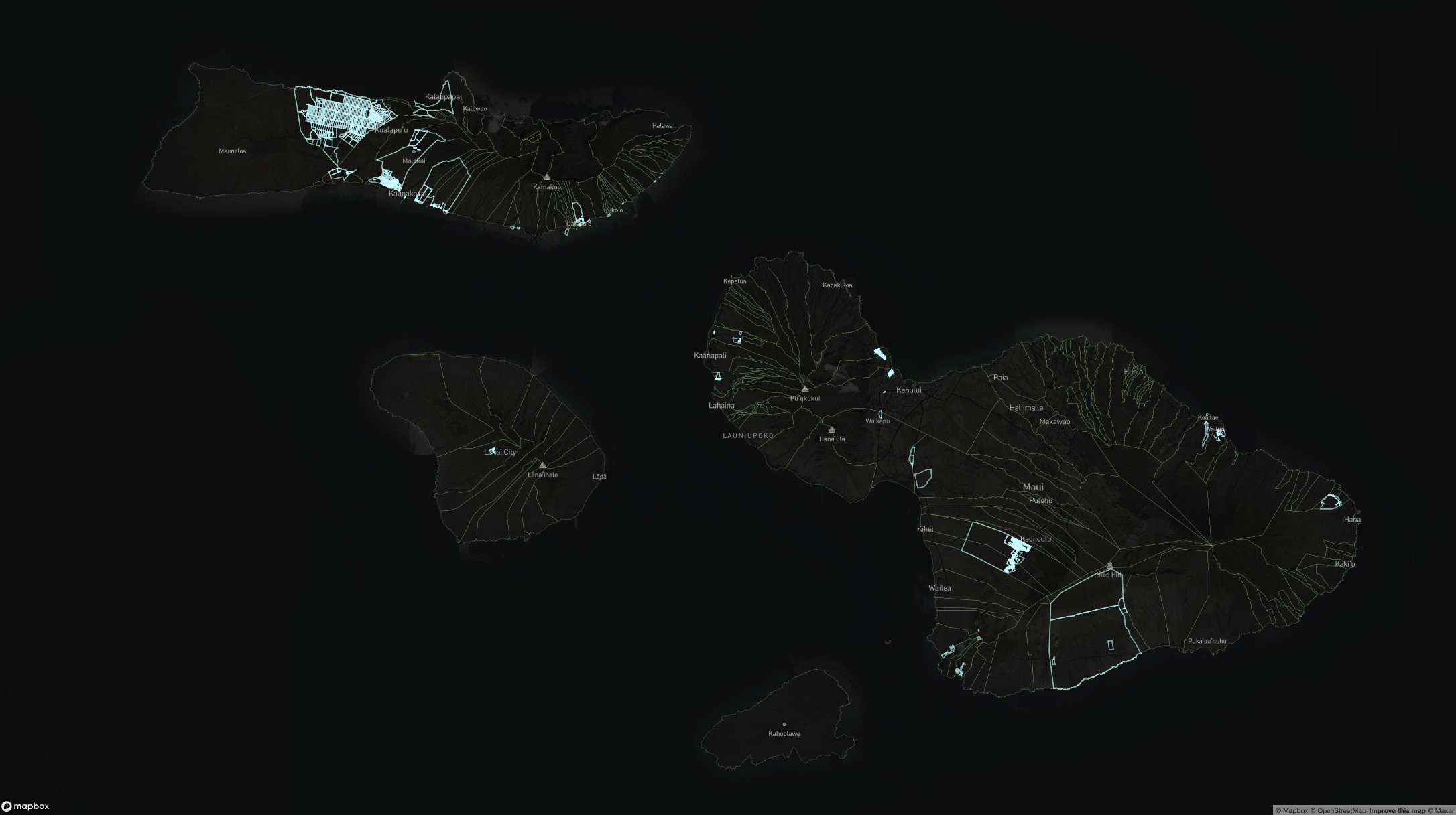
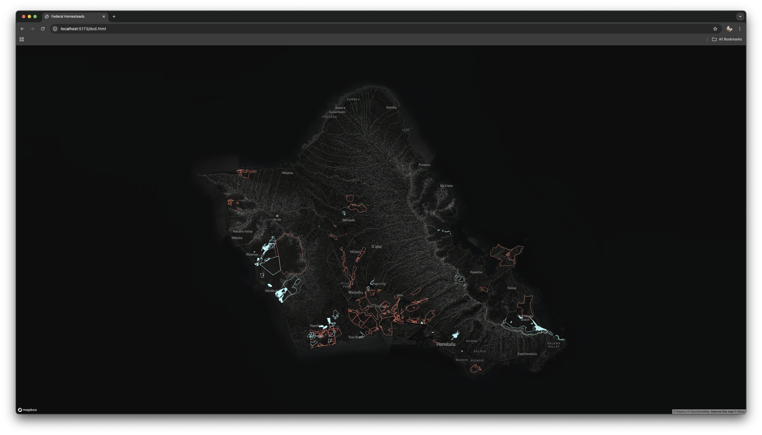
In Okinawa, I confronted the overwhelming presence of the US military, with over 70% of Okinawan land under US military-control. Hawai‘i shares parallels with this legacy of the industrial-military complex – but to what extent? To explore this question, I visualized the presence of Native Hawaiian Homestead Lands juxtaposed with lands leased or owned by the US Military.
I also included the ahupua‘a boundaries to visualize the degree of displacement. I then calculated the relevant percentage of total surface area for the Island of O‘ahu.
Hawaii Rail Transit x Third Place Analysis
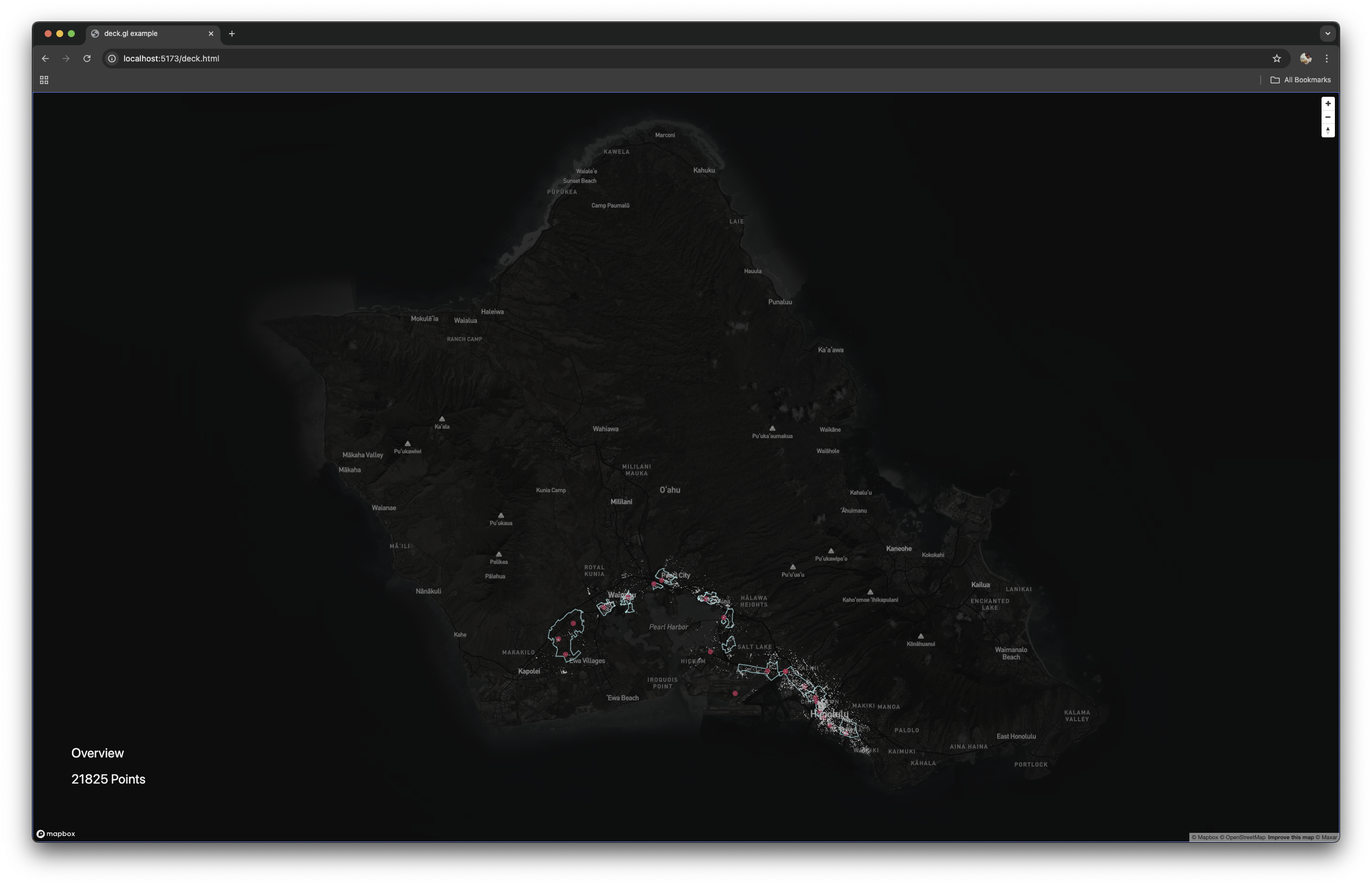
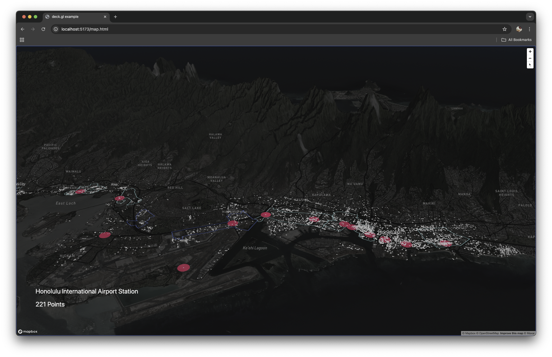
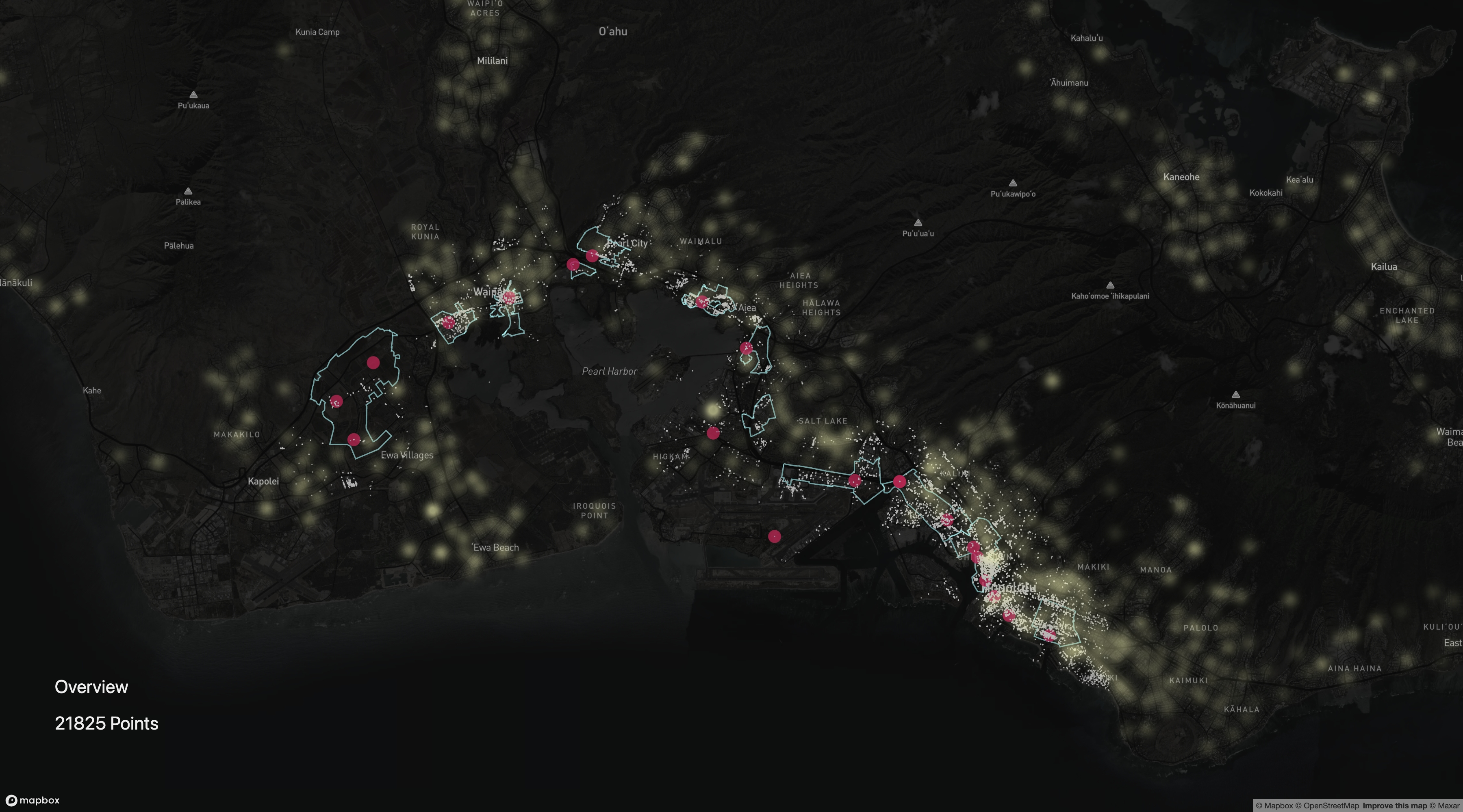
I assessed urban vitality within a 0.5 mile radius of each rail station, Honolulu’s new transit project. I took “urban vitality” to mean walkability and access to Third Places”, and assumed that this distance is considered “walkable”. I developed a data scraping and processing pipeline, using the Google Places API, to identify possible “third places” within this radius to assess social and cultural accessibility. This method yielded over 20,000 Third Places.
The heatmap reveals the population centroids of census blocks for the island of O‘ahu. It becomes apparent that the stations and the transit-oriented development zones fail to be centered in a population distribution, exacerbating the last-mile problem and limiting access to rail transit. The asymmetrical distribution of Third Places reveals the density of Third Places dramatically increases as one travels eastward. This reveals a directional bias in the planning which failed to consider rider motivations in using the transit line.
Erosion and Flooding Scenarios x Vulnerable Populations
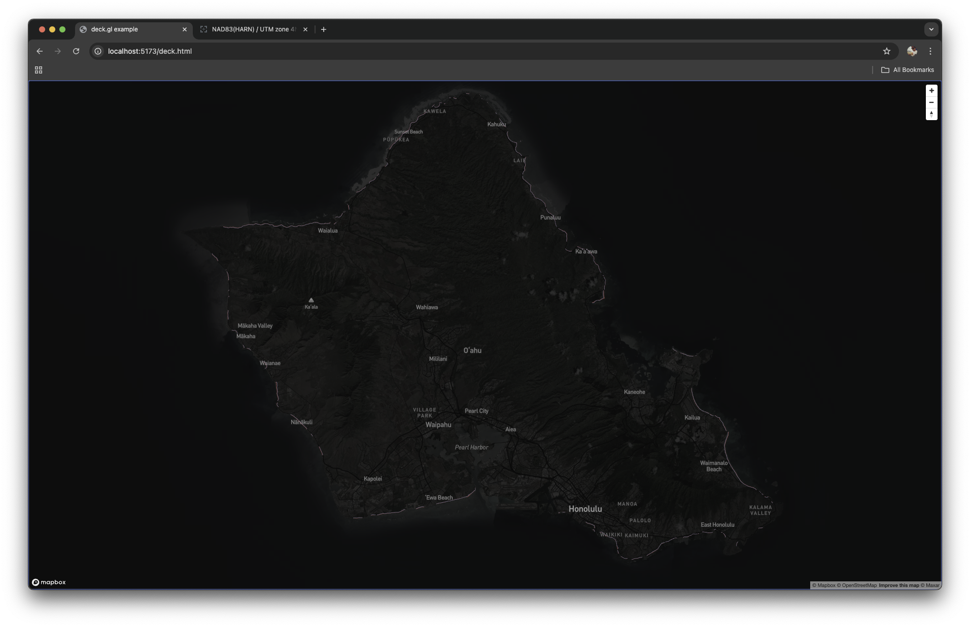
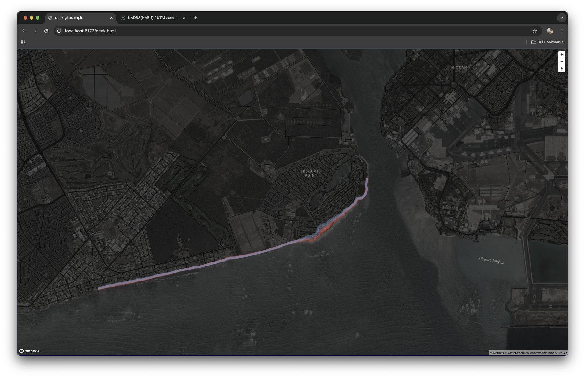
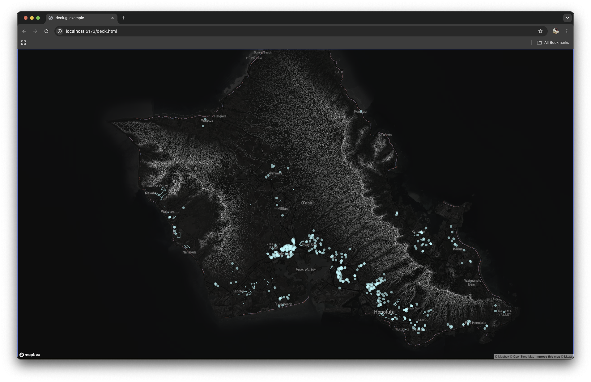
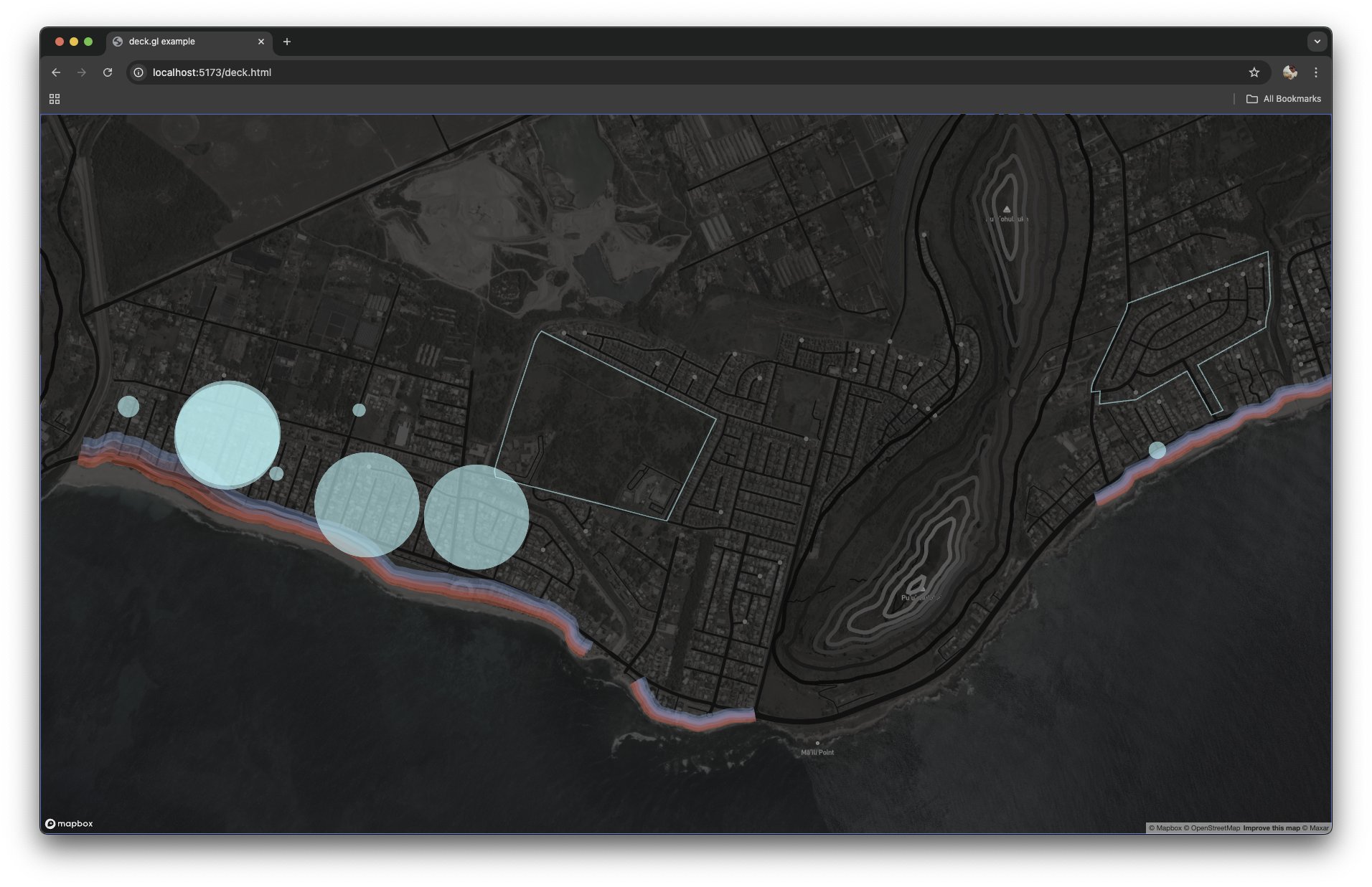
Island nations are the first to feel the impacts of sea-level rise. In this visualization, I juxtaposed the traditional boundaries of the Kanaka Maoli land divisions, current location of Hawaiian Homestead Lands, and elderly care homes and day care sites. I wanted to understand the extent to which different vulnerable groups might be impacted by visualizing different flood scenarios.
Four different scenarios of sea-level rise were visualized: 0.5ft, 1.1ft, 2.0ft, and 3.2ft. The colors used were from red to blue, respectively. The geo-polygons depict the Hawaiian Homestead Lands, and the circles represent the elderly homes or day care sites, with larger diameters representing higher density units.